A while ago I was hanging out at my parents house, and got my hands on my dad’s Kindle Fire. Now, my dad is 60-something years old, and has always had a thing for tech – but he’s also getting on in years, has bifocals and all that fun stuff that comes along with age. So, the option for him to change the typography options in his Kindle ereader application is right up his alley. Pretty sweet feature, right?
Then I looked at the e-book he was reading.
Maybe… maybe not such a sweet feature.
It looked a little like this:
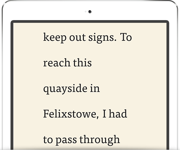
I’m not exaggerating. The above shot I recreated with the controls available to me in Instapaper.
The problem isn’t my dad. He’s just trying to get something laid out in a way he can read it. Unfortunately he created the Twilight of the typesetting world while trying to do so, but whatever.
The actual problem? The interface designer not making a decision.
Now, before you jump down my throat about removing all user decisions, I’m with you: users should have decision-making power with the interfaces they’ve paid to use. However, it’s up to the interface designer to give them a map and compass, not just dump them in a forest somewhere and hope they make it back home with their pants on.
Too Much Choice
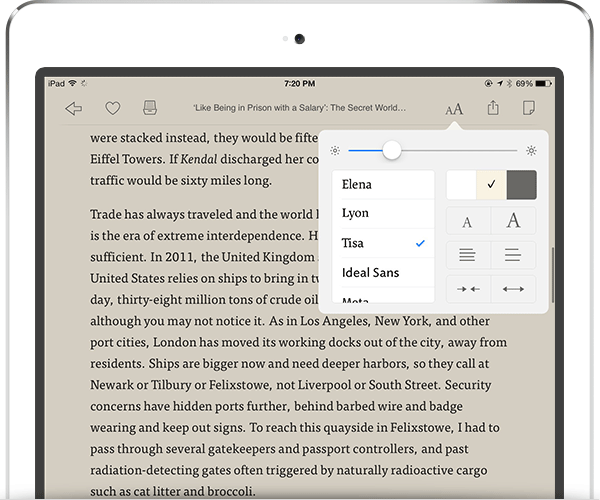
The issue, and I’ll pick on Instapaper for now (even though I love it and use it daily), is that there is too much choice for the reader, and the choices the reader can make exist independently from one another. Thankfully both Instapaper and the Kindle app restrict font choices to a pre-determined set of readable fonts, which is good. However, certain decisions that the user can make – like changing type size – should in turn affect related items like line length and leading (this is typography 101); instead, in almost every ereader application, each of these variables is adjusted individually.
The end result can be really bad, as evidenced above, and make for a terrible reading experience. It’s unfair to the original author and layout designer too.
Realistically? I shouldn’t be able to create a typographic monstrosity like I did above. Even if I did have a bit of fun doing it. The Kindle app handles this problem a bit better than Instapaper by providing a reduced range for each adjustment, but it’s still too much in my opinion (and they’re still independent).
It’s a problem that didn’t exist when we just read paper books through our monocles whilst riding in our horse-drawn carriages. Book designers, well-taught in the intricacies of long-form reading experiences, chose typefaces, font sizes, leading and line length all in combination to create a reading experience that suited the content and context. But, with new devices come new challenges.
The Simple Solution
To me, the solution isn’t all that complicated (and granted, I’m focusing on the user controls area of ereader typography as opposed to the whole pie), but it requires confidence on the interface designer’s side. Instead of providing independent controls, like so:
…provide one control for font size adjustment, with automatic related/bundled leading and line length effects that have been based on typographic best practices. I’m admittedly working with anecdotal evidence here, but most readers likely just want to control type size. Most won’t even notice leading or line length – and, in fact, they shouldn’t notice it if it’s been designed properly in the first place.
So, simplify it. Give the reader a simple font size adjustment control (and a list of pre-selected typefaces); that font size control in turn properly corrects leading and line length based on the font size variable. The end result? The reader chooses a type size that is comfortable for their context, and the tried-and-true tenets of typography remain in place as a decision made by the designer.
An example in practice would be this: the user makes the font smaller by tapping the [A -] button. The app then a) adjusts the line-height to be about 1.5x the new font size and b) adjusts the margins of the page to become larger so as to shorten line-length to between 50-75 characters (the generally accepted best line-length for reading body copy).
If the one-control approach feels a little heavy-handed, or too dramatic a change, then at least have these independent controls buried under an “Advanced Options” sub menu.
Either way, it makes sense to me — and then I can avoid developing that nasty eye-twitch when my dad proudly shows me his new e-reader.